Hope Worldwide

Non-Profit Website Redesign
Project Overview
Hope Worldwide was designed to achieve and instill greater hope in underserved communities by equipping volunteers and responding to disasters.
However after browsing through their website, my team and I found that their navigation was unintuitive and unclear, resulting in lessened volunteer sign ups and demotivating to current supporters. How might we improve the website and provide a more concise and modern user experience?
Hero image of HopeWW
Non-Profit Redesign
UX Researcher & Designer
August 2021

Tools:
Figma
Miro
Invision
Google Suite

The Problem
Hope Worldwide serves a noble cause, but due to their website's incohesive design and navigation, volunteers and supporters alike could either not:
   > Sign up as a volunteer
   > Learn more about the organization by importance of content
These two factors established a lack of interest and difficulty in communicating the organization's mission and goal, despite their hard work as a philanthropy.
Research
As User Researchers my team and I wanted to discover how the target audience of Hope Worldwide would interact with the website. We wanted to understand how users would make decisions on where they navigate and why. Therefore, we first conducted a general online survey to receive some understanding of people's perceptions of volunteering and what makes them so popular. Through that survey, we found that users valued communication and that they mainly found volunteer opportunities through word of mouth; not many were actively looking for non-profit organiziations. We then conducted 1 on 1 interviews and task interviews of the current iteration of the website to see what current works as well as its failings.

    1:1 interviews, surveys, task interviews, stakeholder interview.
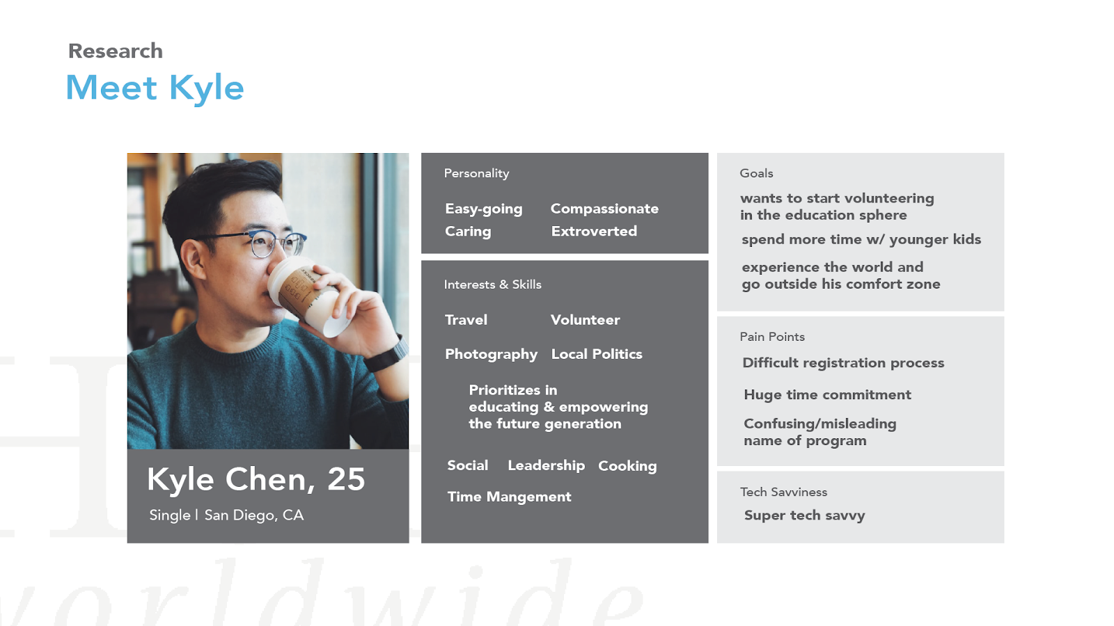
Meet Kyle
User Persona of HopeWW.
With our research conducted, we arrived at a user persona of Kyle. His goals are to volunteer in education and empower children, whilst earning opportunities to show on his resume. However, Kyle was intimidated by our current website's confusing navigation and high level of commitment to even learn about said opportunities. During this phase of research, we repeatedly iterated on the proto-persona and decided to focus on the volunteer aspect of our current product. Through the Stakeholder's interview we were able to discover that Hope Worldwide values a steady influx of volunteers. And thus led to our decision to highlight that aspect and feature of our product.
Cardsorting on Hope Worldwide
Cardsorting done on the current website's navigation.
IA Sitemap of Hope Worldwide
IA Sitemap created to envision the future redesign.
Ideation
With the current websites architecture, we found it not to be intuitive nor self-explanatory.
As our team restructured the current navigation options blindly, we found that our redesign was completely different from the current website.

Our team wanted to utilize the website's current offerings as a way for future volunteers to learn more about the program and sign up. The stakeholder's interview was a great insight as to the current goals of the website:
    explain the program, increase sign ups, and provide methods of supporting the cause.
Low-Fidelity Wireframes
With the current direction of the website, our team had to decide between presenting as much information without being overbearing.
Feedback from user-interviews showed us the importance of images, especially for newcomers. We wanted to show visual cues to direct users, without having to present too many options at once.
Low Fidelity prototypes (sketches > low-fid).
Style Guide
After we designed the wireframes, we came up with the color palette and typeface we thought best represented the organization. Since the stakeholder wished to keep the logo as is, we wanted to honor it and use the colors from the logo.

My team and I wanted to utilize the same colors of the logo, but also keep the website clean and simple without seeming outdated. The current website utilized a simple sans-serif font, but we wanted to updated it with and Avenir. Avenir is is exceptionally legible and clear to read, making it highly versatile for use in headers and body text.
Style Guide of HopeWW.
Hi-Fidelity Wireframes
Mid-Fidelity, working prototype.
And this brings us to our final version of the website. We wanted to decrease the amount of scrolling by a third, and revamped the hero and images to be more inviting. The goal was to improve the call to actions (CTA's), and allow users to have a clear understanding of where to navigate.
Final Thoughts
This project was some of the most challenging work I've done. Working and collaborating with stakeholders, whilst trying to understand user needs was a challenge that needed to be addressed. But I learned to embrace "failure." After traditional education in the US, I've have a mentality ingrained in my working process: to never make mistakes. But with the design process being fluid, I wasn't so used to having a chance to go back and work on my failings and learn from them.
Learning to take another step back and look at our progress from a larger view was a painstaking lesson I learned. Especially with the large nature of the project, it was incredibly easy to get lost in the details and tunnel on them.  

The design process isn't always so straightforward.
This was a lesson I learned late. As designers we won't always find an answer and solution so easily. It takes multiple re-iterations, testing, and always going back after new discoveries. As much as we want to get it right on the first try, that isn't always the case.

Research, Research, Research.
Build empathy. As much as I wanted to be in the shoes of the user, I cannot. That's what research is there for. Throughout this project, I found myself trying to understand user motivations and how they would navigate websites.
Before becoming a designer those thoughts had never really crossed my mind. Behind every action there is a motivation, unconsciously or not.