Affinity Diagram of interview results.
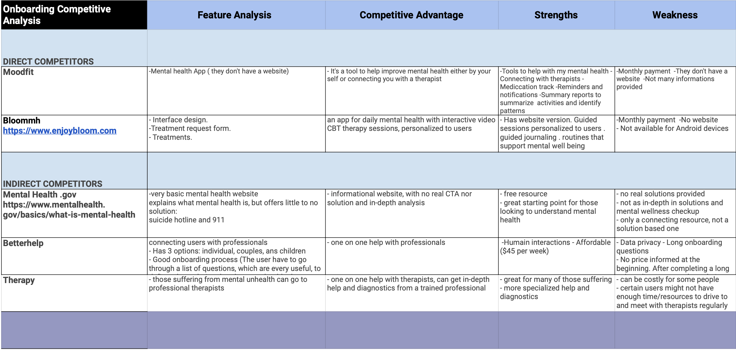
Competitor Analysis of current mental health resources & solutions.
Research
We first looked into mental health statistics, especially with the start of the pandemic. We had a general gist that there would be a need or deterioration in mental health, and we wanted to address that need/question. According to the National Health Interview Survey (NHIS), there has been a 30% increase in the number of adults with symptoms of mental disorders. And so, to gain better insight, my team and I conducted a Google survey on mental health and 1 : 1 user interviews. We then compiled the results into an affinity diagram.
To highlight some of the notes:
“I don’t think I know any mental health resources aside from suicide prevention hotline.”
From the survey:
> Found mental health resources through online & friends
> 70% of survey participants preferred website format
Competitor Analysis
We then conducted a competitor analysis of the current offerings on mental health. We found that many of the current competitors require a high bar of entry, making it more difficult for users to sign up. Currently most of these competitors also merely attempt to connect their users with licensed therapists, whilst not providing their own solutions. And every single one of the competitors we analyzed required compensation, further contributing to the entry bar.
Usability Testing
With our completed Low-Fi wireframes, we conducted user tests. We drafted a user testing plan through Google Suite, an interview script (to be as consistent/unbiased as possible) and went away on the testing spree. One of the main features of our products we wanted to focus on was the Journaling tool. But we also wanted to make sure users had an ease in onboarding and learning resources. Therefore, we set up three tasks for our research participants:
1. Onboard using Google sign ups.
2. Navigate to the articles sections.
3. Navigate to the journaling tool and enter a journal entry.
Three pages of MindLine (Homepage, Yoga, Articles). Built using HTML 5, CSS, Javascript, Bootstrap and Github.
Final Website
We arrive at the final iteration of MindLine. The Front-End prototype was fully created utilizing HTML5, CSS, Javascript, and Bootstrap. Due to time and resource constraints, the team and I were able to create webpages of the main homepage, the yoga page, and the articles page. In an ideal situation, we would have liked to prototype and build out the user flow for the journaling tool, but were not able too. In the future, building out the onboarding, the journal as well as a mobile app would be our next steps.